This Website
Table of Contents
(This is kinda meta)
Overview
I made this website to have a little showcase of myself on the web, both for professional advancement as well as just a way to show off what I’m up to to friends and family. It’s something I’ve talked about doing on and off for years but finally got around to committing to it.
Although I originally intended to write it entirely word by word in HTML, I switched to using the HUGO website builder to help me accelerate my progress and simplify updating it in the future. I am hosting my website on Netlify, with the source files hosted on my GitHub account.
Takeaways
- Switching to HUGO was immensely helpful for ensuring that my content is consistent as well as enjoying the pages it automatically generates like tag pages in addition to the content itself.
- Making a functional site is easy, but making it engaging is not as straight forward
- Adding a showcase or two to the home page really helps with this!
- Small responsive designs also help make a website feel more lively, especially when hovering over elements
- Writing up projects is time consuming
- Designing for mobile helped me improve my design for desktop too
Progress and Plans
I’ve reached a point where I am satisfied with the way my content is laid out, even adding some responsive elements! I’ve also uploaded all the projects I’ve worked on that I feel are worth showing off here. (So now I can go back to adding to that list!)
Other than updating the website with my future projects as they come, the next major addition to the website will probably be a “dark” theme so I can exercise my CSS abilities and please my friends that haven’t used a “light” theme since 2018. Maybe I’ll also make more use of the footer I included, to toggle the themes or have some other information about the website.
Detailed Report
After years of throwing around the idea of having a personal website I committed and purchased this domain December 30th, 2021. Just in time to ring in the new year. Originally I wanted the savo.ca domain but it has already been purchased and now redirects to a site about the benefits of owning a .ca domain. The irony is a bit frustrating.
Finding a Host
The next step in the process was finding a host for my website. I considered rolling my own server with some spare Raspberry Pi’s or my NAS but to keep things simple for myself I decided to go with a commercial host instead.
After doing some research the main concern for me was the cost, so I was trying to find the cheapest service since I [currently] do not most of the features offered to me. After asking my sister where she hosted her site and how much she pays for it, I decided to go to Netlify since the their basic plan is free.99.
Website Architecture
I initially intended to make the website largely, if not entirely from scratch in HTML and some potential scripting. After I started, I quickly came to realize some of the limitations of using pure HTML - namely that it was difficult to modularize one’s website. This meant that in order to have a consistent header and footer I would need to either copy them into each .html by hand, or resort to some trickery like scripts.
I have these original scraps of a website I prepared in HTML by hand available for download here for those curious.
After looking up solutions I came across the concept of Static Site Generators (SSGs), which as the name implies, build static HTML pages for you programmatically that you then host. Of the ones available the one that stood out and I decided to use was HUGO. I picked it for a few reasons:
- It was on the shortlist of recommended builders for Netlify.
- It advertised itself as the fastest which is nice
- It is open source and based in Golang which is new to me, so I wanted to warm up to that language
- I knew a guy named Hugo once, while all other builders had names no child should bear.
In addition to the benefits of having the SSG follow templates for my content, so I could easily update shared elements, it came with several advantages I quickly began to use. Most notable for you, the user, are the “list” pages used to outline the contents in each directory. Since these are all generated and updated automatically as I modify the content on my site I don’t have to think about them past setting their templates!
Website Design
I would like to minimize the amount of scripting needed for my website, ideally keep it at zero to ensure that the content is viewable by anyone with just an HTML parser. To that end I am try to stick to only formatting the website with CSS, and so far I have been successful at sticking to it.
The design used is inspired (stolen) from a print portfolio of my projects that I prepared at the end of my third year studies, roughly April 2019, with the help of my sister. (I still need to grab that font!)
After many rounds of tweaking of the .html templates and my .css files, I’ve arrived at what I can comfortably call my final layout for my site.
General Layout
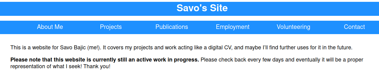
I wanted the website to have a constant header and footer on every page to help with navigation, even if the footer isn’t quite utilized right now. Between these would rest the content of each page.
In the header I wanted links to every section of my website, as well a drop down list for subsections under “Projects”. I also added “breadcrumb” navigation so users can easily go back to other sections of interest. This is the list of links just below the section tabs that goes like:
“Projects” / “Personal” / “This Website”
In the footer I reassert this is my site and have a toggle for light or dark mode (so it can be independent of browser settings).
Single Pages
The layout of single pages (any specific content, e.g. a job or project) is pretty basic. Other than inserting the header and footer, all that there is to them is two sections: an intro section and the content. The intro section is what covers the brief meta details of the page at the start such as the title or tags, this is everything between the header and the second horizontal line. Anything below the second horizontal line to the footer is the content taken straight from the .md files that describe it.
For figures I don’t use the normal  markdown format but instead use raw HTML code in the content file so I can use CSS on the image and caption together. For example, the html code for the previous figure on this page is:
<figure>
<img src="/images/website-portfolio-clip.png">
<figcaption>A section from the print portfolio</figcaption>
</figure>
You can see that I do not actually write the figure number (i.e. “Figure 1 - “) for each figure on a page. I originally did this, but then learned about CSS counters which can be used to dynamically number content for you so I don’t need to keep track of them anymore and can easily reshuffle them as I please. To increment this counter and add the text to each caption I have the following set up in CSS:
figcaption::before {
  counter-increment: figure;
  content: "Figure " counter(figure) " - ";
}
Making a Figure Shortcode!
I use a lot of figures for my website, originally I used the HTML code shown a bit before this. However the annoying thing with using raw HTML in my Markdown files is that it made it hard to change how all my figures looked, needed me to manually add an alt text for each image (I didn’t bother) and a couple other minor headaches. Most notably if the image was missing then I wouldn’t be warned of an issue! For this reason I developed my own shortcode for figures based on HUGO’s own one.
This shortcode addresses my issues mentioned above, and so now to put a figure into a post I invoke the following line instead of the HTML above. There are other parameters I can pass in such as a title, or attributions and the alt text and caption for the figure are updated to reflect that.
{{< fig src="/images/website-portfolio-clip.png" caption="A section from the print portfolio" >}}
To rework my files I used the following ugly line of bash script to go through and replace my old HTML with this command. Even so I had to go through and manually work out some cases where quotation marks (”) were or there were HTML links (for schematics mostly) used in the captions.
find . -type f -name '*.md' -exec sed -Ezi 's/<figure>\n/{{< fig /g;s/<\/figure>/ >}}/g;s/<img //g;s/<\/figcaption>\n/"/g;s/<figcaption>/caption="/g;s/" >\n/" /g;s/">\n/" /g' {} +
This bit of code finds all the files in a directory and then executes the sed command on them which is responsible for altering them. It goes through and administers a series of small rules that combine to the desired effect: removing the HTML tags, replacing them as needed with the needed shortcode portions, and putting everything on one line.
List Pages
List pages are used whenever there is sub-pages, for example the personal projects page to show all these sub-pages. They are similar to single pages, with the use of a header, footer, and inserting content from .md files, however they also have the list appended to them. This is why most of the lists have a description from short like on the personal projects page, to longer when describing an overarching project like with the ESC project.
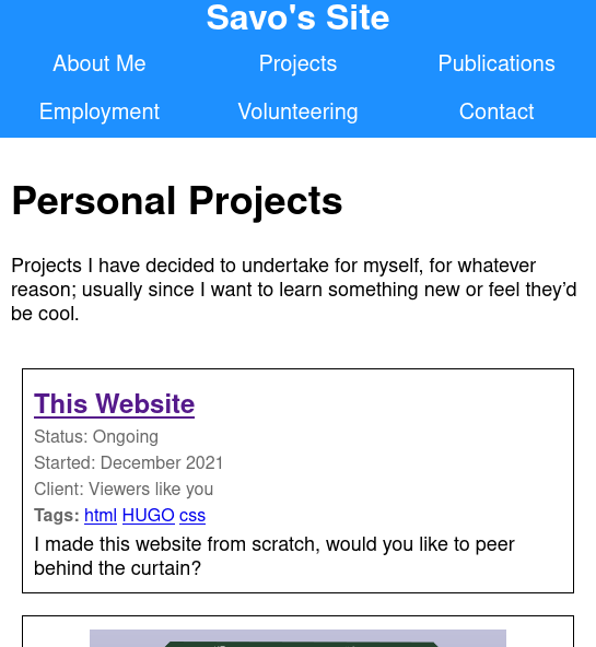
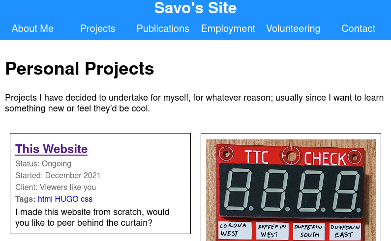
I made two types of list, a basic list where each entry is one after another, which I use for my work and volunteer experience pages to appear more like a CV. And another where the content is split into two columns for a more interesting and fun layout for other places where chronological order isn’t as pressing, namely projects, although it is used on the home page too.
Designing for Mobile
I have been designing this website on my computer so I didn’t really worry about the size of figures or how the layout of my header and lists would be affected when using a narrower window. However once I started running my site and people were accessing it on their phones I was soon told of some of the issues and poor user experience they were having. These issues included:
- Figures being too tall so significant scrolling was needed to read project pages
- The header links would wrap in odd ways as the screen got smaller, splitting unevenly into multiple rows
- Project lists were hard to read on mobile.
With these issues I set about trying to improve the experience across all devices by delving into CSS. And testing using a typical browser window on my computer and another one I resized to approximate a phone’s portrait resolution. There were three main things that helped me improve my site:
- CSS media queries
- CSS-flexbox layouts
- Font based units (
emandrem) for dimensions
Media queries were used to allow my layout to be responsive to the window size, namely width. If the browser’s width fell below a threshold a different set of formatting specifiers were used to accommodate a mobile interface. This was used extensively with the flexboxes to rearrange content so it would look right on a mobile.
The flexbox layout was used in two main places, the header for the links and the two-column lists. Flexboxes allow content to tile within them and prescribe the behaviour as the outer flexbox changes size or the boxes within it. For example with the header, by default each link gets an even split of the horizontal space (1/6 = 16%), however once the screen narrows, to split across two rows gracefully I bump them up to 33% and have them wrap inside the header to effectively form two evenly spaced and sized rows. A similar approach is taken with the two column lists, although going from 50% width to 100% as the screen is narrowed.
Font based units found their main use in making sure that elements “felt” the right size such as figures not being taller than a set number of lines of text (addressing the excessive scrolling issues). They were also used for the breakpoints regarding site layout since the headers needed to fit a certain number of characters in a row to have all six section in one row, otherwise they needed to be split across two rows. A similar story with the project columns needing a certain number of characters in a line otherwise they would be too narrow to read comfortably.
This process really helped me improve my user experience on both mobile and desktop.
Designing my Homepage
My homepage is completely different to the rest of the website so I actually prepare it as its own html template.
Originally is served as little more than a landing page that had a little blurb and visitors had to navigate to pages of interest through the section tabs in the header.
I wanted something more inviting and helpful for people that visit, especially stanger that might not know or care too much for me (yet!) so I decided on the layout that it uses now. The introduction block, featured pages (I set these manually), and then my most recently updated pages.
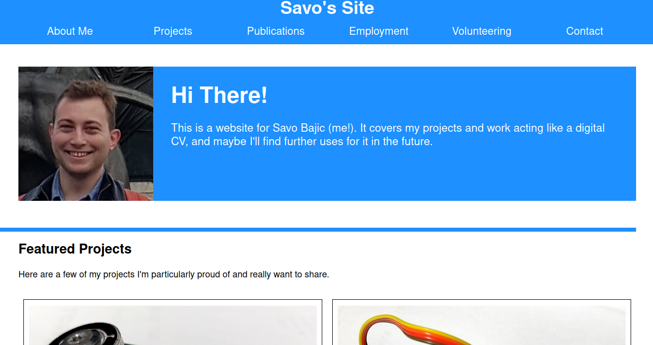
The introduction block is entirely written in raw html code that describes it.
As for the two lists, I reuse the multi-column list structure I prepared but pass in specifically selected lists. For the featured projects list I use a hand-curated list of pages that I store in the header of the home page’s _index.md file. For the most recently updated pages, I have Hugo go through all my pages and sort them by their most recent change based on the commit history. It then pulls out a handful of the most recently updated ones to put in the list.
I feel that by showing these projects on the main pages, especially my hand selected ones makes the website feel much more of complete website. I have received feedback from friends that even though they weren’t originally seeking some of the projects that are featured they still visited the pages because it was shown to them and it sparked their curiosity.
Dark/Night Mode
I added a dark/night mode theme for my website after some feedback from friends. I went for a red/white colour scheme and that wasn’t too difficult given that I had already made most of my CSS use variables for colours (there were a few places I found I had hard-coded a colour but these were addressed). I simple made a different class for the root to have the dark theme colours and that was it. I made a media query in CSS check if the user’s browser had a preference for dark mode and if it did it would activate this class.
@media (prefers-color-scheme: dark) {
	:root {
		--navBarColour: FireBrick;
		--altNavBarColour: Red;
		--mainText: White;
		--navText: White;
		--subtitleText: WhiteSmoke;
		--backgroundColour: Black;
		--altBackgroundColour: #600000;
		--unvisitedHyperlink: Red;
		--clickedLinks: FireBrick ;
		--activeHyperlink: Blue;
	}
}
Note: I have since moved these variables into the <body> tag since I felt that having them at root was a bit too high.
This worked fine, however I wanted the visitor to be able to toggle the setting manually if they wanted to and then have that setting persist over visits. So I had to get into some scripting.
Scripting a Dark Mode Switch
I had avoided scripting until now with the website since I largely didn’t have a need for it. However after looking up some examples online for how to do exactly this I found one example for how to toggle and save the user’s theme preference, and another to record the initial preference from the browser on their first visit. By combining them I could achieve exactly what I wanted. Fortunately the code was about a dozen lines each so combining them wasn’t too difficult.
To store the user’s preferences between visits I use the localStorage system which I just store a variable for if the theme should be dark or not. On loading a page this is read and acted on. If it is not present (likely a first time visitor) then the browser’s preference for a dark mode is checked and then acted on accordingly.
var body = document.body;

// Check if there is a preference present
if ('darkMode' in localStorage) {
  // There is a stored preference, maintain user preference on page reload
  if (localStorage.getItem('darkMode')) {
    body.classList.add('darkMode');
  }
}
else {
  // No preference present, determine from user's browser preferences

  var match = window.matchMedia('(prefers-color-scheme: dark)');

  // If there are matches or not
  if (match.matches == 0) {
  	// No matches, user doesn't prefer dark mode, use lightmode
  	body.classList.remove('darkMode');
    localStorage.setItem('darkMode', 'false');
  }
  else {
  	localStorage.setItem('darkMode', 'true');
  	body.classList.add('darkMode');
  }
}
To toggle the theme manually I have an element on the page with a specific ID. When it is clicked then a short script toggles the theme and records it.
window.onload = function() {
// Click on dark mode toggle. Add dark mode classes and wrappers. Store user preference through sessions
const switcher = document.getElementById("darkModeToggleSwitch");

switcher.addEventListener("click", function() {

		//If dark mode is selected
		if (localStorage.getItem('darkMode') == 'true') {
			body.classList.remove('darkMode');
			localStorage.setItem('darkMode', 'false');
		}
		else {
			localStorage.setItem('darkMode', 'true');
			body.classList.add('darkMode');
		}
})
}
I did encounter issues with the manual toggle code at first. This was because I was originally having it run prior to the page being loaded so the toggle element wasn’t yet rendered. This was remedied by enclosing the relevant code in the window.onload = function () {..} statement highlighted above.
The toggle for the theme is currently a hyperlink in the footer. I’ll look to maybe put it somewhere easier to find in the future but I feel it is fine there for now.
Adding Content
All the content for the site is prepared in markdown (.md) files within folders that match the structure of the website, as per HUGO guidelines. Media and such are uploaded to the “static” directory, also as per HUGO guidelines. For more detail about how these are then synthesized into HTML, please refer to the HUGO documentation here.
To prepare one article takes me usually a couple of hours, especially if it is an old project that needs me to sift through my old photos on my phone for something to use. Sometimes I also need to retake photos to make them nicer (generally on clean backgrounds). With some of my really old electronics projects that I did with EAGLE before my student license expired, I also need to import them into KiCad which I use now, and iron out the issues with this conversion process to create the media for them.
Once prepared, I push a commit related to that content up to the GitHub. Once uploaded, Netlify detects the push and rebuilds the site with the new data and begins to host it immediately if there is no issue during build. HUGO is actually able to use the dates of my Git commits to determine the date a file was most recently modified automatically!
Changing the Internal Formatting of Posts
Originally I wrote all my posts by breaking each line manually somewhere between every 100 and 125 characters. This made it easier to edit on my desktop where I had a large screen, however on my laptop it was awkward to edit such posts. So I have since made the executive decision to go back and remove these artificial line breaks so that I could have my editors wrap the words as I pleased on any device.